
%22%2F%3E%3Ctext%20x%3D%2250%22%20y%3D%2250%22%20dy%3D%220.35em%22%20text-anchor%3D%22middle%22%20font-family%3D%22system-ui%2Csans-serif%22%20font-size%3D%2248%22%20font-weight%3D%22700%22%20fill%3D%22hsl(24%2060%25%2092%25)%22%3EK%3C%2Ftext%3E%3C%2Fsvg%3E)
%22%2F%3E%3Ctext%20x%3D%2250%22%20y%3D%2250%22%20dy%3D%220.35em%22%20text-anchor%3D%22middle%22%20font-family%3D%22system-ui%2Csans-serif%22%20font-size%3D%2248%22%20font-weight%3D%22700%22%20fill%3D%22hsl(280%2060%25%2092%25)%22%3EB%3C%2Ftext%3E%3C%2Fsvg%3E)
%22%2F%3E%3Ctext%20x%3D%2250%22%20y%3D%2250%22%20dy%3D%220.35em%22%20text-anchor%3D%22middle%22%20font-family%3D%22system-ui%2Csans-serif%22%20font-size%3D%2248%22%20font-weight%3D%22700%22%20fill%3D%22hsl(150%2060%25%2092%25)%22%3EL%3C%2Ftext%3E%3C%2Fsvg%3E)
%22%2F%3E%3Ctext%20x%3D%2250%22%20y%3D%2250%22%20dy%3D%220.35em%22%20text-anchor%3D%22middle%22%20font-family%3D%22system-ui%2Csans-serif%22%20font-size%3D%2248%22%20font-weight%3D%22700%22%20fill%3D%22hsl(45%2060%25%2092%25)%22%3EG%3C%2Ftext%3E%3C%2Fsvg%3E)
%22%2F%3E%3Ctext%20x%3D%2250%22%20y%3D%2250%22%20dy%3D%220.35em%22%20text-anchor%3D%22middle%22%20font-family%3D%22system-ui%2Csans-serif%22%20font-size%3D%2248%22%20font-weight%3D%22700%22%20fill%3D%22hsl(210%2060%25%2092%25)%22%3ED%3C%2Ftext%3E%3C%2Fsvg%3E)
Wpis użytkownika Opornik w Grafika

OpornikGURU
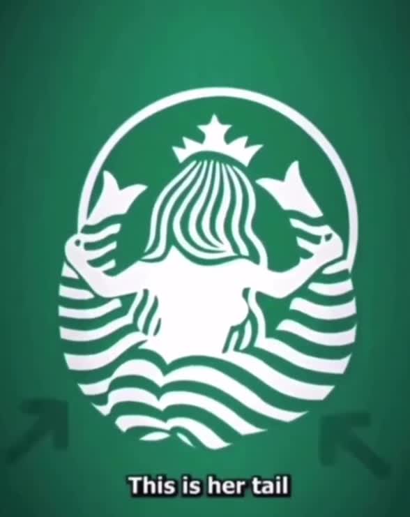
4piorunówZastanawiałeś się jak logo Starbucks wygląda od tyłu?
Ewolucja logotypu Starbucks:
https://www.logomaker.com/blog/starbucks-logo-history-and-evolution-of-strabucks-original-logo/
The nautical theme was intentional. The company decided it wanted to forge a connection to the seafaring tradition of coffee traders. After all, coffee’s journey to your cup has always involved long voyages across oceans. So, when it came time to design a logo, they needed something that screamed maritime.
That’s where Terry Heckler came in. Heckler was a local artist and advertising specialist tasked with creating the original emblem. He delved into old marine books and stumbled upon a captivating image: a twin-tailed siren, or mermaid, from Greek mythology. She was designed to lure sailors with her charm.
It felt like a perfect metaphor: just like sailors were drawn to sirens, customers would be drawn to the alluring aroma of Starbucks coffee.
Komentarze (0)
Brak komentarzy. Bądź pierwszy!